Responsive preview

Review every screen size in one place

Switch between desktop, tablet and phone widths with one click and comment on each layout. Mobile feedback stays with the mobile view, so it never gets confused with desktop.

  • Desktop, tablet and phone
  • Comments scoped per width
  • No device lab needed
Phone-width preview of a website inside ClientTweak
The problem

Responsive feedback is where most review rounds go wrong

  • A client reviews on their phone and reports issues you can't see on desktop.
  • Mobile and desktop comments end up in one long, confusing list.
  • Nobody remembers to check the tablet layout until after launch.
  • Resizing the browser window by hand never lands on the right width.
Highlights

Built for websites that have to work everywhere

Three preview widths, one project, and feedback that stays organised.

Desktop view

Review the full-width layout the way most visitors on a laptop or monitor will see it.

Tablet view

Check the in-between width where navigation and grids most often break.

Phone view

See the narrow mobile layout and pin comments on buttons, menus and stacked sections.

Comments per width

Feedback is scoped to the page and width it was left on, so mobile notes appear in the mobile view.

One click to switch

Toggle widths from the top bar without reloading the project or losing your place.

Viewport recorded

Each comment also saves the reviewer's viewport size, so you can match their exact layout.

Switch widths without leaving the review

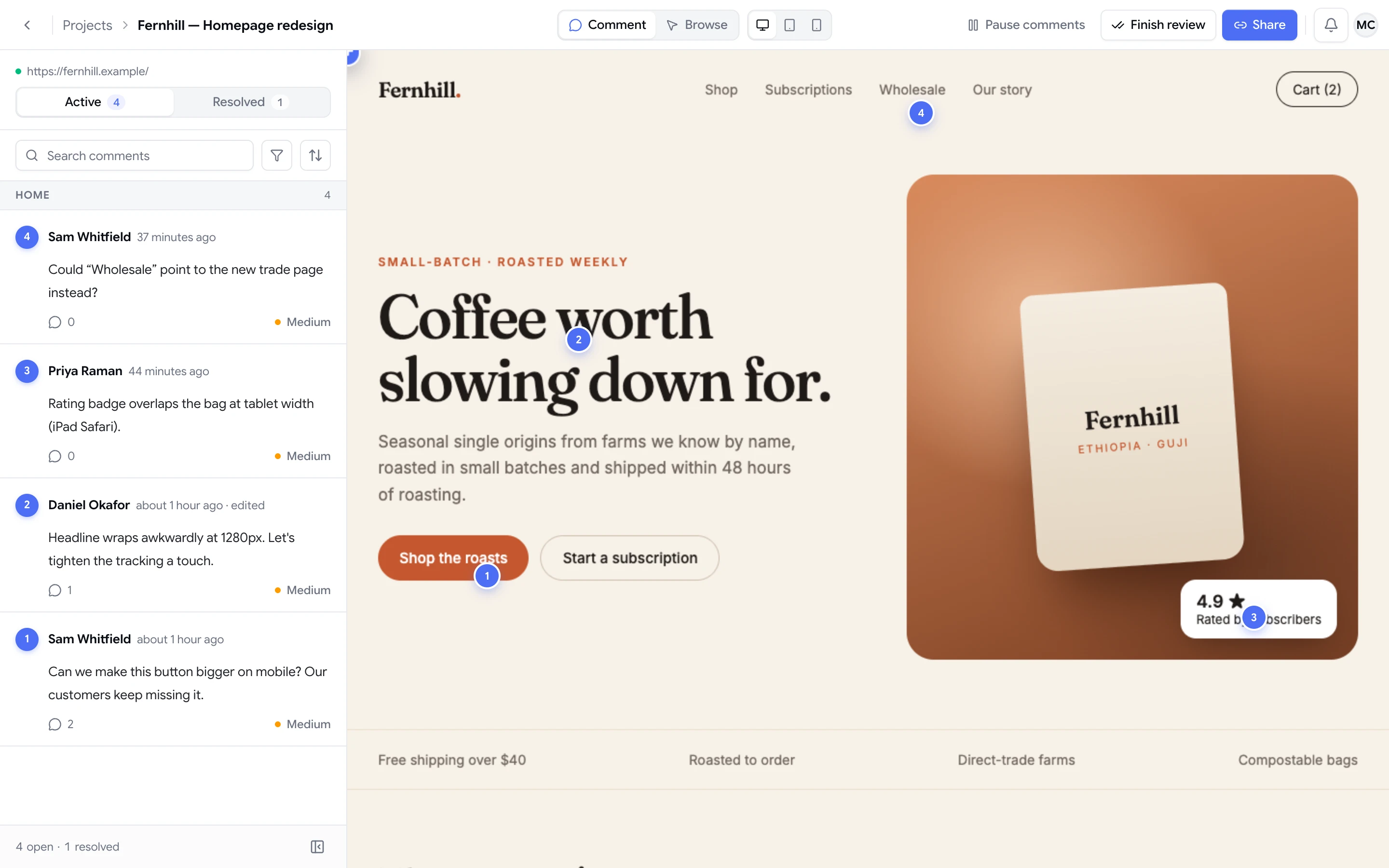
Responsive design means at least three layouts for every page, and each one deserves its own review. In ClientTweak, the desktop, tablet and phone toggles sit in the top bar of every website project. Click one and the page re-renders at that width, with the comment layer still on top.

That makes it easy to run a proper responsive pass: review the desktop layout, switch to tablet, then phone, pinning comments as you go. No browser dev tools, no resizing windows, no borrowing someone's phone.

  • Desktop, tablet and phone toggles in every website project
  • The comment layer works at every width
  • Browse mode works at every width too
ClientTweak review screen: a client's homepage with numbered comment pins and the comment list beside it

Mobile comments stay with the mobile layout

The biggest problem with responsive feedback isn't collecting it — it's keeping it straight. A note that says “the menu covers the logo” only makes sense on one screen size.

ClientTweak keeps each comment with the page and the width it was left on. Open the phone view and you see the phone feedback. Open desktop and you see desktop feedback. Your developers know exactly which layout to open before they start fixing.

  • Comments are scoped by page and preview width
  • Each width shows only its own pins
  • Less confusion between mobile and desktop issues
A comment thread with replies, pinned to a button on the page

A responsive check before every launch

Use the previews as a checklist before a site goes live: work through the key pages at each width, pin anything that looks off, and assign it. Because every comment also records the reviewer's viewport size, issues reported from real devices are easier to reproduce in the closest preview width.

When the fixes are in, resolve the comments and do one more pass at each width. The resolved tab keeps a record of what was changed.

  • Run a page-by-page pass at each width
  • Assign responsive issues to the right person
  • Resolved comments keep a record of what changed
How it works

A responsive review in four steps

  1. 1

    Open the page

    Use Browse mode to get to the page you want to check.

  2. 2

    Review on desktop

    Pin anything that needs attention at full width.

  3. 3

    Switch to tablet and phone

    Repeat the pass at each width from the top bar.

  4. 4

    Assign and fix

    Comments stay with the width they belong to.

FAQ

Frequently asked questions

How do I check how my website looks on mobile?

Open the website project in ClientTweak and switch to the phone view in the top bar. The page renders at a phone width and you can browse and comment on it there.

Which screen sizes can I preview?

ClientTweak has three preview widths: desktop, tablet and phone. You can switch between them at any time in a website project.

Do mobile comments show up on the desktop view?

No. Comments are kept with the page and preview width they were left on, so phone comments appear in the phone view and desktop comments in the desktop view.

Can clients review on their own phone?

ClientTweak is designed for desktop browsers. Reviewers can use the phone preview on their computer to see and comment on the mobile layout.

Does ClientTweak record the reviewer's screen size?

Yes. Each comment saves the reviewer's viewport size and scroll position, along with an optional screenshot of what they were looking at.

Is this a replacement for testing on real devices?

It's a fast way to review responsive layouts and collect feedback on them. For final QA you may still want to check a few real devices, and ClientTweak helps you track whatever you find.

Get started

Check every layout before launch.

Desktop, tablet and phone in one project, with feedback that stays on the right screen.

  • Unlimited guest reviewers
  • Nothing to install
  • One flat price